The idea is to provide an option for Moodle administrators to offer an alternative, simplified UI for especially the novice users to get to started quicker building their quizes (similar to progressive disclosure, they can then move on to the full UI later, if needed). Currently the UI is so complicated and miscommunicative that unexperienced teachers are refusing to use it (I am quite sure that this is not the case just in the University of Tampere, where I come from). Nonetheless, I believe that even experienced users will benefit from making the UI better communicate what and how it is meant to be used, and by showing more of the information required at each stage of the process of creating or managing a quiz.
The proposition includes two new screens, each organized into a tab of their own. (See also: the appropriate parts of the old proposition). As we go on, we will need to confirm everything conforms to the current conventions of Moodle, but I don't think will be an obstacle.
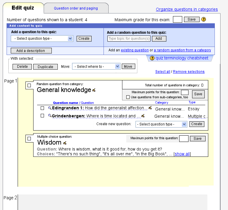
The first screen shows the actual content of the quiz. Here, you can
- add new questions,
- add new random questions,
- add new questions inside random questions,
- manage the properties of an individual question in the quiz (mainly “maximum points for this question”),
- use a question or a random question as a template for new ones (that is, make copies of questions and edit them),
- set the maximum grade for an exam (like in the old UI)
- remove questios from the quiz
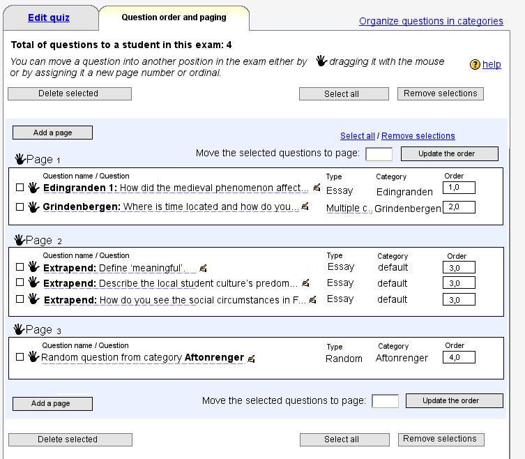
The second screen is a tool for organizing the questions within and into pages, (and for adding new pages). This functionality is, using UI design terminology, already a mode inthe current UI (checkbox “Show the reordering tool”), but moving it to a tab of its own makes the mode more explicit and thus, helps the user to recognize it and to act accordingly.
To understand further UI design justifications for new screens, please see the new Quiz UI redesign prototype presumptions page in Docs. The main question that document answers is: Why can't we just make smaller fixes to the current UI?
After developing these new screens, we will have an UI to match the users’ natural conceptual model(s). This will be a good start on which to further develop the user experience. In the future, if feedback from the community (you!) is positive and further usability testing shows that the new UI works for the different user groups, this new UI may replace the current UI altogether. For that to happen, further features will need to be introduced, though, and further discussions had. There are further issues down the road, such as how to make the overall quiz navigation reflect the actual relationship between the question banks and quizes (this is also central to users who mostly just import their questions), but luckily we can move in small steps and just have a separate, simplified UI for just creating/managing quiz content, at first.
I will probably work on this funded by the Finnish equivalent of Google's summer of Code (this link seems to suffer downtime today) - or if not by them, then by another interested party. After funding has been confirmed, I will disclose the more detailed project plan.
