To Candice and everybody else who is involved in design:
First of all thanks for your great work, and I'm also quite pleased that the new design is trying to declutter the sometimes less than obvious navigation in the current Moodle version. That's why in our new course design we were also thinking about a cleaner layout:

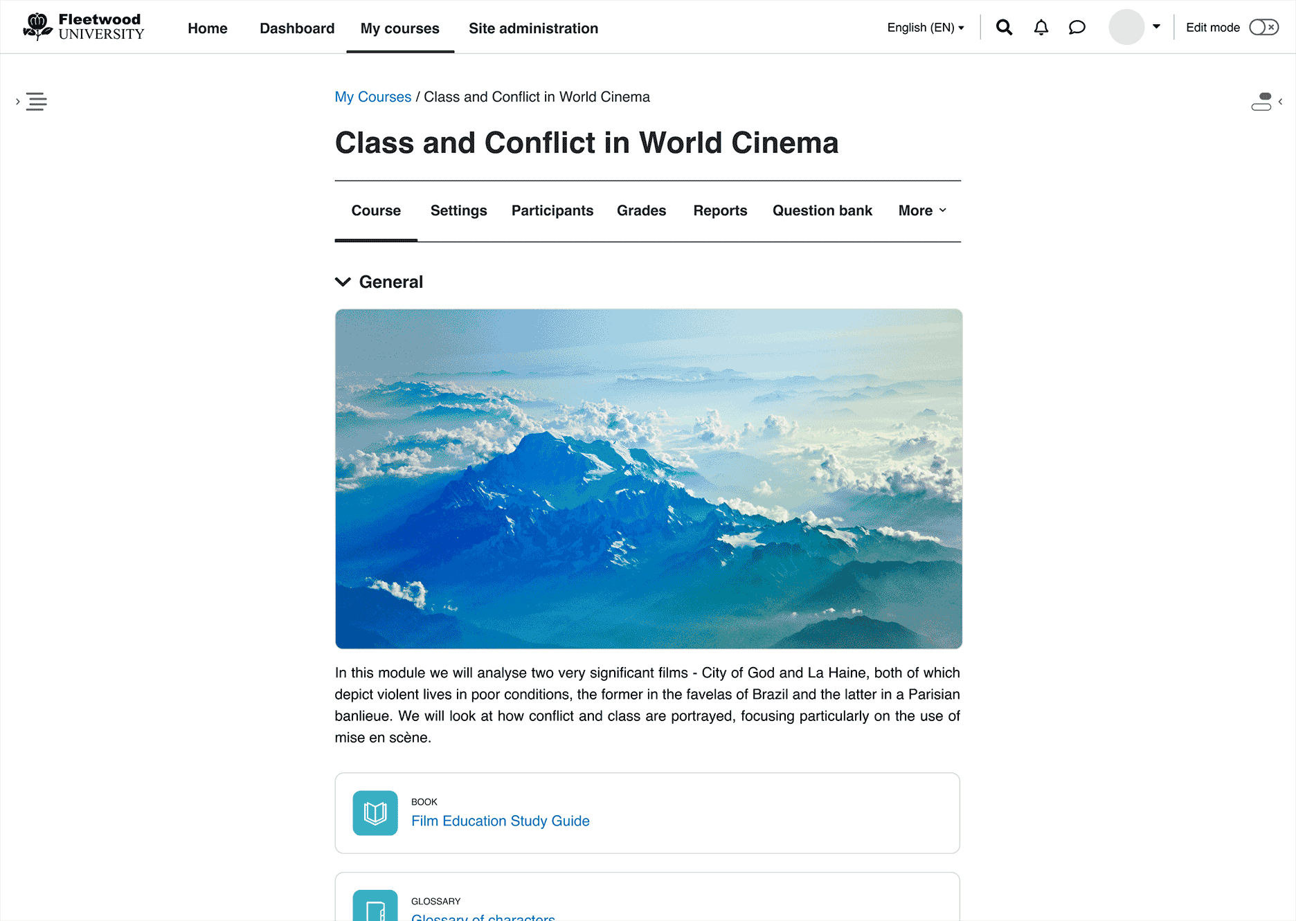
The elements I like are the clear navigation at the top the course index and the fact that you can always hide the blocks on the right side so easily.
I have concerns with the course index: How will it look when you have a lot of resources in a course: Our courses typically have around fifty resources per topic. So from what I guess is the current state of design, this will lead to an endless long course index. Or will there be an option to collapse the part you don't need?
The priorities of the navigation links under the main title at the top of the page where also a bit surprising to me, as I definitely have other priorities there, but hopefully this will be customizable through theme plugins.
Another concern is the huge amount of white space on the left and right of the main course. On some devices this means that you could lose some screen estate especially when you move to activities like quizzes who probably still have to present more information at one glance.
Another thing I like and dislike at the same time is how the main content behaves when you blend in the navigation bar or the course index. From a users perspective it is very good that the main content doesn't change its width which at the moment can lead to content to move outside of the viewport of the user. What I like less, is the fact that the content moves to the side, but I guess that's still a preferable solution to the current state in Moodle 3.10.
To summarize, the will to make Moodle literally more visually accessible is clearly visible, and I hope that the new design will consider the needs of institutions who build big courses with many resources. I suppose, indendation of activities and resources will still be an option as it reflects the hierarchy of materials presented. And I certainly hope that the new design won't break all the great plugins available for the core system.
After your presentation I'm curious what other design improvements will come along the way in the next months.


