
At SIGCSE, I ran into D.I. von Briesen and he suggested I post some info about some graphs we've been generating on our local Moodle installation. This work was originally done by some students for a class project, and it is still a bit rough, but I'd be happy to contribute it. We also have a paper in the ASEE conference this summer on our experiences with students using Moodle with these graphs enabled across an entire semester.
Anyway, what we've done is added some simple graphs that are visible to students or course staff on each gradebook page. The graphs make use of the categories and weights you've set up in your gradebook, if you are using those features. On the main grades page that students see a graph like this (a screenshot from live course data, with the student's info blocked out):
This graph, which is sometimes called a pixel area graph, summarizes the student's performance on all the work graded so far. The height of each bar indicates the student's score, while the width of each bar indicates the weight for that assignment in the student's overall grade. If you mouse over a bar, you get a tooltip (the mouse pointer didn't show up in this cut-down screen capture):
There is a dropdown list at the bottom of the graph so that student can select alternative views, and so that other graphical representations can be easily plugged into this extension to the gradebook. Right now, students can select a star graph if they wish:
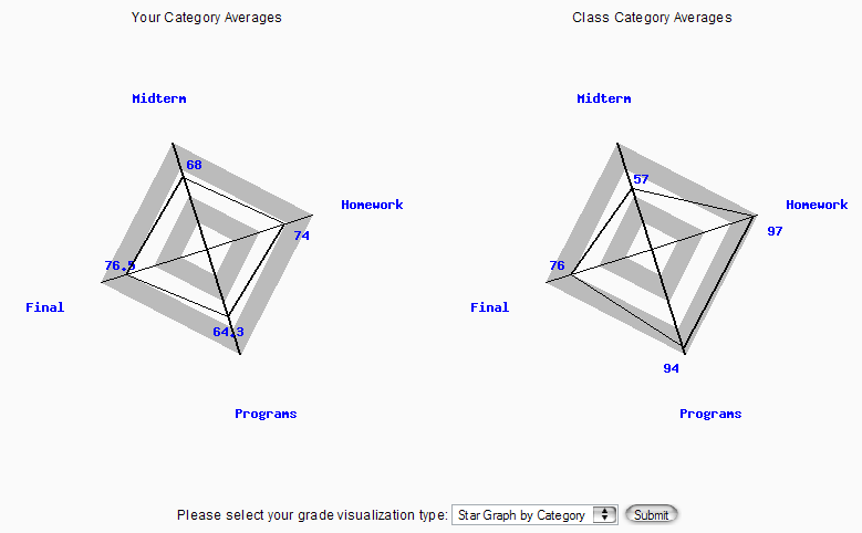
While the first graph is pure HTML, the star graph is rendered using GD. Each radial axis represents one category in the gradebook, so you'll get a different kind of polygon depending on how many categories you have. The student's overall performance across all assignments in that category is plotted as a distance from the origin. The left portion shows the student's performance, while the right one shows the class average. In this case, the student has performed better than others on the midterm, about average on the final, and worse on homework and program assignments.
When a student drills down into a specific category, they see a bar graph of their scores on all assignments in that category:
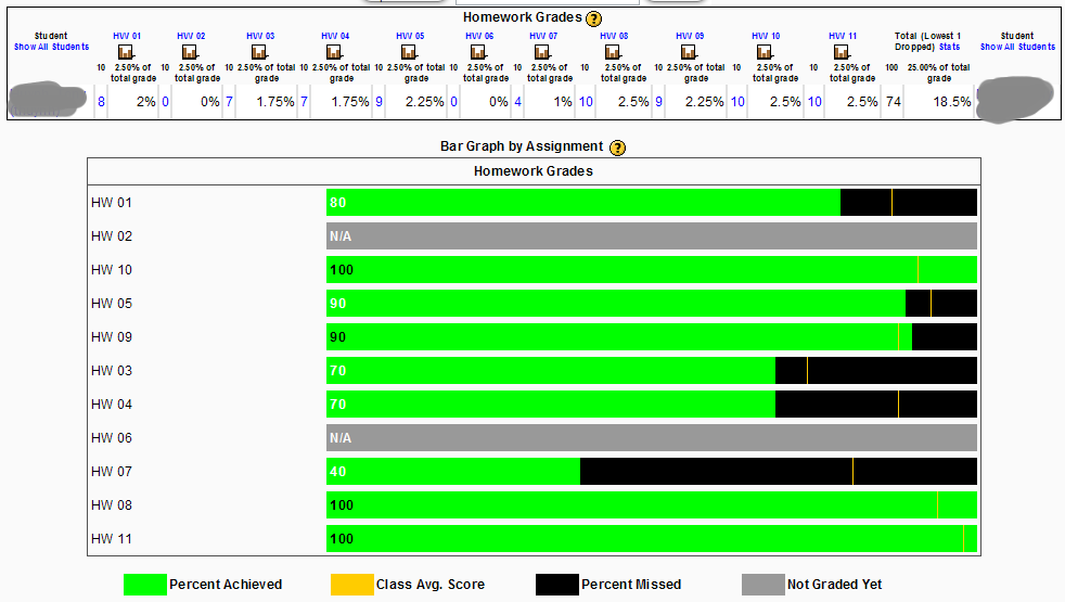
The bar graph is pretty straight-forward, and is just HTML. It shows the student's performance on each assignment, together with an indication of the class average on that assignment.
Instructors get to see the same graphs when using the gradebook. Usually, when looking at scores across the class, the graphs show the class average instead of "your" scores, but when you drill down to a particular student's information, instructors see the same version that the student would see when looking up their own grades.
We do have a student that is working on a line graph that shows the student's "grade trajectory" over time, together with a projection of future performance (based on a regression model) and the "envelope" of best possible and worst possible outcomes the student can achieve based on their current grades, but that one isn't ready yet.
If anyone is interested in making use of this code, I'll try to pull together some instructions and post the code here on the forum.


