Over in this thread, a list of success measures is given:
As success measures, we are primarily looking at improving user flows to:
- Reduce number of clicks
- Reduce task completion times
- Reduce the number of ways you can do one thing to simplify the learning curve
- Look at how we can improve and simplify actions performed
- Simplify the user interface
I am not sure if that applies generally, or just to the create course project, however I though it worth discussing here, in the general forum, rather than leading another thread off-topic.
I think those are all good metrics, except for the first one. Please allow me to explain why. There are really two reasons:
1. Not all clicks are equal
- A click with an instant response (e.g. opening a drop-down menu) is much nicer that a click followed by waiting for a response (new page load, or dialogue that requires Ajax to load data).
- A click on a big target is much easier than a click on a fiddly little icon.
- A click on something visually distinctive is easier to excute at speed than if everything looks the same.
- A click on something self-explanatory is easier for new users to learn than having to figure out a cryptic UI.
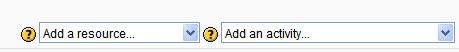
To illustrate: lets peek ahead at my first example in reason 2:
Old edit acivity UI a row of cryptic icons.

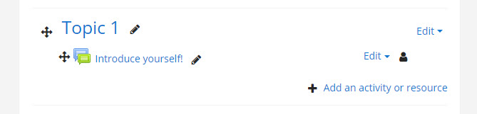
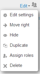
- The edit menu opens instantly, and in a predictable position, so muscle memory will take you to common choices.
- Both the edit menu and the choices are big areas to click.
- Choices have icons for quick visual recognition ...
- but also have explanatory lables.
And, page intially less cluttered with the just the edit menus, rather than the hundreds of icons. I bet you would not be suggesting getting rid of 'Turn editing on' mode if we had the old UI!
2. Almost all the change that acutally improved Moodle usability in the past added clicks
- Row of icons -> Edit menu for editing activities on the course page. (Adds one click.)
- Row of icons -> Edit menu in the question bank - and probably other places too.
- In all the really big forms, collapsible sections. (Adds a click to access some settings, and means some settings are not immediately visible, so if you are not sure what section to look in, you may have to go hunting or Expand all, but most of the time makes the form less daunting, and makes it much quicker to get to the settings you want, because the sections are logical.)
- Old Add activity drop-downs (2 clicks)
to new Activity chooser dialogue (3 clicks, but on much bigger targest with icons, explanatory text, etc.)
Summary
I am not saying that we should give our users RSI, but your second measure "task completion time" is the important one. Slavishly counting clicks is going to lead you astry. (In my opinion. Obivously, this is all just my opinion.)
I acutally think there might another measure you are missing: something like:
- The amount of time the user is thinking about the subject matter they are learning and teaching, as oppposed to how often they are thinking about where to click next in Moodle.