Version 0.3 of the Quiz UI redesign, a fork of Moodle 1.9, has been published. This includes the quiz editing tab (though some minor functionality is missing there, too), but not yet the paging/reordering tab.
http://pilpi.net/software/moodle_quiz_ui/demo/
user: demo
password: demo
I warmly welcome any comments.
The compulsory/-ive disclaimer:
Though it looks rather good, this is pre-release pre-alpha quality software. It might break. You can still play with the demo all you want, as long as you don't hack into the server. For testing purposes you can just create boatloads of new quizzes every time you break an old one.
For example, attempting to move a question onto an empty page may cause the quiz contents to be corrupted. I do appreciate if you tell me where it still breaks. This will be fixed asap, but for now, you have been warned. It is also in english only, and will probably be pretty friggin' ugly on IE for now. And the HTML doesn't quite validate yet, either.
In reply to Olli Savolainen
Re: Call for comments: Quiz UI redesign demo published
by Olli Savolainen -
Surprisingly enough for me, the discussion started in the demo moodle's news forum 
http://pilpi.net/software/moodle_quiz_ui/demo/moodle/mod/forum/view.php?id=1
user: demo
password: demo
http://pilpi.net/software/moodle_quiz_ui/demo/moodle/mod/forum/view.php?id=1
user: demo
password: demo
In reply to Olli Savolainen
Re: Call for comments: Quiz UI redesign demo published
by Olli Savolainen -
There was a comment from Tom Robb there:
"The current 1.9.2 version and earlier ones had a nasty habit of making quiz items inaccessible to other quizzes if they were created within a quiz, rather than using the Question link in the admin panel. That seems to have been cleared up with this revision. Wonderful!"
This may be a bug covering another bug? Does someone know something about the reasons behind this kind of behaviour in 1.9.2?
In reply to Olli Savolainen
Re: Call for comments: Quiz UI redesign demo published
by Wen Hao Chuang -
Hi Olli I just tried the demo/demo to login, but it didn't allow me to, could you please double check? thanks!
In reply to Wen Hao Chuang
Re: Call for comments: Quiz UI redesign demo published
by Olli Savolainen -
I think I answered this in another thread earlier, but just to make sure random passers-by find their way:
UPDATE: demo moved to http://test.moodle.org/head/ and the login credentials are provided in that address.
In reply to Olli Savolainen
Re: Call for comments: Quiz UI redesign demo published
by Julian Ridden -
Thanks for the work on this. I really don't know where I sit yet..it is so different and I was so used to the old one. That being said, there re many things about the existing interface that are clunky...so I am all for the design.
Reactions so far:
That's it for now. Is looking very solid and fixes much of what I didn't like before. Ill keep playing with it and post other thoughts later as they come to me.
Reactions so far:
- Could you use AJAX to Hide and Show the Question Bank. This would remove the need for the page load each time this is clicked
- Again, only if AJAX is a possibility, why not have each page as buttons down the left hand side of the editing interface (i.e. page 1 then Page 2, Page 3, etc underneath) This would then allow teachers to easily switch between pages they are creating and avoid the issue of really long pages to scroll through when editing.
- 3. If we are talking redesign, I would really like to see the "Description" question type renamed to "Label" as this is the standard Moodle term in courses for this functionality. It is one less thing teachers would need to learn as they know what Labels do already.
That's it for now. Is looking very solid and fixes much of what I didn't like before. Ill keep playing with it and post other thoughts later as they come to me.
In reply to Julian Ridden
Re: Call for comments: Quiz UI redesign demo published
by Olli Savolainen -
Thank you! It is very encouraging since the feedback from the first round was umh, in kind of a different tone .
1. Most of the code for this functionality actually exists already, if you look at the source of http://pilpi.net/software/moodle_quiz_ui/demo/moodle/mod/quiz/quiz_edit.js. It did not work smoothly enough though, so I have commented it out for now.
2. Hiding/showing entire pages is indeed an idea worth considering. Thanks! I have so far only thought about it in terms of collapsing some parts of questions, as my original plan was to have the questions include more editing functionality than they do now (especially for random questions). Collapsing the pages by default seems to defeat the purpose of having all the needed information readily available to especially novices, but this might be an option. Also, the forthcoming reordering/paging tab will include a more compact might alleviate this need.
3. I agree that "description" indeed seems a poor term. I have not had the courage to make such a past-incompatible change on my own, but I hope we could to it once and for all. I am not sure "label" is descriptive of the uses of that element though, since it is used usually as an instructive text?
In reply to Olli Savolainen
Re: Call for comments: Quiz UI redesign demo published
by Olli Savolainen -
Thought of the showing/hiding pages further. Since teachers need to be capable of moving questions between pages even on the edit page (or do they really?, just being capable of showing just one page at a time seems restrictive.
But if the long page is the result of the teacher him/herself opening all the pages, they do have the chance to make the page less long by hiding some of the pages and scrolling might be less irritating.
However, this seems a relatively novel idea for replacing paging, and would require extra usability testing to bring it in, so for now we will probably stick to more traditional solutions.
In reply to Olli Savolainen
Re: Call for comments: Quiz UI redesign demo published
by Anthony Borrow -
Olli - I just took a quick, cursory look at the work on the Quiz UI. Overall my impression is that it is more intuitive and prettier (more pictures). A couple of things that you may want to consider. In the attached screen shot it appears that if you choose a random question from a category you provide a sampling of some of the questions (how many - I'm thinking you may have some big question banks). Would it be helpful to provide at some level the ability to set the number of sample questions to show? Might a hide sample random questions be helpful. Also, when I went to preview mode it showed that none of the random questions had enough questions. I would have expected question #3 to have had enough since it was showing some of the sample questions. I agree that AJAX moving of questions would be cool. I recently provided a patch for blocks that created 'move to top' and 'move to bottom' icons/buttons.I'm not sure if that would be helpful or not here. The issue is having too many options takes up precious space and complicates the UI. Keep up the good work!Peace - Anthony

In reply to Anthony Borrow
Re: Call for comments: Quiz UI redesign demo published
by Olli Savolainen -
Thank you Anthony, again .
The UI is supposed to warn users when random questions are dysfunctional. Haven't added that yet.
I am a bit hesitant to create an "UI preferences" screen in the first place, but yeah I guess the number of questions to sample (currently 2 3) would be one of the options, in addition to the "hiding by default" of pages proposed by Julian, above, as well as perhaps "Display questions from sub-categories too", "Also show old questions" (though those are kind of tightly related to the question bank window, hm). But do you really think having an option to remove them altogether would help? Could you provide an example situation (use case)?
It will probably be more fruitful to discuss moving questions once I get to the reordering tab.
Peace to you, too (: Olli
In reply to Olli Savolainen
Re: Call for comments: Quiz UI redesign demo published
by Anthony Borrow -
Olli - I can imagine some teachers not wanting or needing to see sample questions for each random question. For example, I taught by topics and had a question back for that topic. When the students took a quiz they received 20 random questions from a larger question bank but all from the same question category. If it were displaying the same two or three questions for each one it has little utility, if it is choosing 2-3 random questions I could see it having some utility. Ultimately all I really cared about was that I had assigned 20 random questions from that question category so having an option to hide the sample questions would be nice but not having it would be something I could live with and probably get used to. By default, I like the idea of having it and would advocate for the 2-3 random samples to actually be random. Peace - Anthony
In reply to Anthony Borrow
Re: Call for comments: Quiz UI redesign demo published
by Olli Savolainen -
Actually I think that the reordering tab may serve this need for a more compact view, but we will see.
I do not think actually randomizing the questions in the sample is a good idea - the purpose is to sample the questions of the category, not to demonstrate to the user what randomness means. This sampling was added since in usability tests, teachers did not understand that the questions in the category actually were included in the random question, since no hint was given about the actual content in the actual question box. If the questions in the box were randomized (and thus different questions would show in different random question boxes of the same category), this might confuse users to wonder about whether it indeed is the same category, or for example, another category by the same name.
Or why would you want them to be randomized there?
Olli
In reply to Olli Savolainen
Re: Call for comments: Quiz UI redesign demo published
by Anthony Borrow -
I would want them randomized so that the teacher has a more accurate idea of the types of questions being displayed as it would give a better/closer idea to the teacher what the quiz will look actually look like. I could see it being confusing to the teachers either way. If you randomize they are not sure if it is the same category. If you do not randomize it they may think that the same questions are going to appear on the quiz. Ultimately, they can use preview to see what a quiz will look like so I do not think it is a big issue. It is just a matter of figuring out which is least likely to cause the most confusion. Alternatively, we could try to confuse everyone and make whether it is random or not something that is selected at random  so that sometimes its random and sometimes not
  Peace - Anthony
In reply to Anthony Borrow
Re: Call for comments: Quiz UI redesign demo published
by Olli Savolainen -
Haha :D
Yeah, there is a danger that one clings on to issues like this and lose sight of the big picture. It is important to make it as simple as possible to start learning the app, and when they do, learning about something like this seems an easy-to-learn one-time thing.
Yeah, there is a danger that one clings on to issues like this and lose sight of the big picture. It is important to make it as simple as possible to start learning the app, and when they do, learning about something like this seems an easy-to-learn one-time thing.
In reply to Olli Savolainen
Re: Call for comments: Quiz UI redesign demo published
by Olli Savolainen -
I am wondering about the very novel/nonstandard confirmation dialog (which only replaces the question bank but is not truly modal) for deleting questions in the question bank.
The severity of this in terms of usability is not drastic, but it may confuse users in any case since it really is novel. So I am thinking that for javascriptless users that could be left intact (optimally, we would only show the confirmation dialog on a page of its own), but otherwise we would show an YUI simpledialog.
The thing is, the dialog uses md5 to confirm the confirming of deleting (umh.). So, in order to replace the dialog in javascript we need an md5 function. I found one, but I wonder if it is worth it to add even more javascript (the page is quite heavy already) and maybe it would in a sense defeat the purpose of the md5 checking altogether.
What do you ppl think? Could the md5 perhaps be replaced with something simpler, or..?
To a degree, this is also an issue as I am planning to add a confirmation dialog when deleting quiz questions, though that is less fatal.
Olli
I'm quite surprised that YUI does not have an MD5 implementation. I think it is worth keeping some sort of check. I don't think it matters if we change MD5 to something else.
I am not quite sure what we are checking for, though. Since the md5 is in the url, just bookmarking that url will basicly make that check moot. If a malicious outside attacker wanted to delete questions, I am sure they could just generate that md5. So it seems to me that just pregenerating the md5 value for the javascript does not seem much of a security loss - if there even was any security gain from this, I am not sure I understand.
<script>
<?php echo "var qdelete_md5=$md5"; ?>
</script>
<script>
<?php echo "var qdelete_md5=$md5"; ?>
</script>
In reply to Olli Savolainen
Re: Call for comments: Quiz UI redesign demo published
by Olli Savolainen -
The other option, if we don't want to include a big js lib on every page, is to load the md5 js on the fly if the user deletes something, which YUI seemingly supports. However, I am not sure how much work this is and for such a minor feature, seems a bloat.
In reply to Olli Savolainen
Re: Call for comments: Quiz UI redesign demo published
by Adam Johnston -
I really like the increased simplicity here. My only questions is why everything is still so separated. For example, why couldn't import and adding questions be on the same block? Or perhaps a collapsible block system system instead of forcing more tabs and refreshes. What I always hated about trying to setup quizzes in moodle is there are about 5 different screens I have to visit to do so, often some multiple times.
Have you considered combining some functions? Maybe one screen for not just adding questions to the quiz, but also where you can have a block on the side for adding categories, importing questions, and adding questions at the top in small blocks with the questions from a specific category below this kinda as it is now so you can add them to the quiz. Make it a one stop shop for quiz/question/question bank creation instead.
Thanks for all your work.
In reply to Adam Johnston
Re: Call for comments: Quiz UI redesign demo published
by Olli Savolainen -
We easily run into the risk of complicating the UI again if we try to bring all functionality into the same screen. The relationship between Quiz and Question bank is UI-wise still a bit unsettled.
I am most interested in hearing the sequence in which you usually do things with quiz: what are the things you have to do in an unnatural order? What is the typical sequence in which you visit different screens? What are the reasons you have to visit some of them multiple times?
For example, it would seem natural to me that questions are first imported to the question bank as a somewhat separate, preparatory task, and then use those imported questions in the quiz editing or category management screens with no considerable cognitive overhead.
"adding questions at the top in small blocks with the questions from a specific category below this kinda as it is now so you can add them to the quiz"
This I did not understand at all.
Creating new categories in the quiz editing screen is still under consideration, since, in a sense, it is part of that process of creating a quiz and at the same time getting organized. At least creating new categories while adding new questions should be supported.
Thanks for your feedback!
In reply to Olli Savolainen
Re: Call for comments: Quiz UI redesign demo published
by Adam Johnston -
When I make a quiz I usually have to:
create the quiz ( which takes me to main quiz edit page)
navigate and create a new category for the questions
go to the import screen, select category, and import the question file
go to the quiz screen to add questions (which I add 10 random at a time 4 times as I need 40 questions)
then, and this is separate, because I use Examview I have to upload the images manually to questions/ppg and to mod/quiz/ppg so moodle can show them using Examview's Blackboard export.
My idea was just hoping maybe there could be a way to add a category and import questions from the basic quiz interface (the main quiz edit page to add questions). This means I only go to the main quiz edit page after quiz creation and nothing else. All I need is there.
They wouldn't need to take up much space (import could be a drop down for type and could use the existing category choice for category to import into and the category add could be a single line with a text space and an add category button below the category selection box itself).
I know it would add some complexity, but the look of the new interface seems to make it simpler to distinguish the two sides so I thought it would be more user friendly to add it and minimize the travel teachers like me have adding stuff while still looking fairly intuitive and uncluttered (they are simplified to be small, not merged full blown as they are under their separate tabs).
In reply to Adam Johnston
Re: Call for comments: Quiz UI redesign demo published
by Olli Savolainen -
You have valid points, though overloading existing UI elements in the way you describe is probably not a good idea since it will become very hard to communicate to users how to use them.
Thank you for your thoughts. Will keep them in mind.
Thank you for your thoughts. Will keep them in mind.
In reply to Olli Savolainen
Re: Call for comments: Quiz UI redesign demo published
by Adam Johnston -
No, your right. I don't even like my ideas in hindsight.
I think all I really wanted looking at it now is the ability from the import screen to tell it to import questions into a new category instead of having to go to the category screen as well.
Still liking the redesign.
I think all I really wanted looking at it now is the ability from the import screen to tell it to import questions into a new category instead of having to go to the category screen as well.
Still liking the redesign.
In reply to Olli Savolainen
Re: Call for comments: Quiz UI redesign demo published
by Olli Savolainen -
I just published the nonfunctional UI for the reordering tab (HTML/CSS completed, that is). There is still a lot of work here in terms of there being way too many distracting elements. It probably can still be further simplified, but this is where we are now. Any criticism/ideas are welcome.
http://pilpi.net/software/moodle_quiz_ui/demo/
user: demo
password: demo
Automatically paging the quiz will be an YUI dialog if the user has javascript otherwise, it will be shown like in the old Quiz UI. YUI tooltips are still missing and this iteration of the reorder tab has not been usability tested yet. I will implement most of the missing functionality this week and usability test it next week.
The entire UI is also in Finnish now, since the usability tests will be in Finnish. Just go to Moodle's front page and select the language there.
This probably still does not work in IE.
A comment from the code:
It is next to impossible to have the "add page here" buttons on the reordertool tab. We already have a surrounding form so we cannot use print_single_button which produces another form. But if we are in the same form, the only way to tell the "add page here" buttons apart from each other is to have the value attribute of the button have the page number after which the new page is to be inserted (This means: have the button label sth like "add new page after page 3". The add page here clutter the UI up too much even without the extra text.) Then, when processing the form, the page number would need to be parsed from that value string. This is so unelegant that I am going to pass at this point. Of course this could be fixed with a bit of javascript later, but that is another story: users without javascript will have to be left without.
In reply to Olli Savolainen
Re: Call for comments: Quiz UI redesign demo published
by Olli Savolainen -
I just published the diff and separate files of the current version also in the tracker.
In reply to Olli Savolainen
Re: Call for comments: Quiz UI redesign demo published
by Olli Savolainen -
The reorder tab is now functionally complete: Even though the repaginating is hidden, it also works ok server-side, but as I am making it an YUI dialog, that dialog is still missing.
http://pilpi.net/software/moodle_quiz_ui/demo/
user: demo
password: demo
There is a lot to discuss still, especially code-wise but also in terms of the UI, but it works now pretty well. Please test it out, and try to break it so we can iron bugs out at this point.
A particular question is whether sending questions to a specific pages should be a separate input field/submit button pair, at this point it is combined with "reorder questions" submit button, which also reorders the questions according to the numbering the user has given.
Also, 6 test subjects have been confirmed from the University of Kuopio to participate in tests next week, on Wednesday and Thursday.
In reply to Olli Savolainen
Re: Call for comments: Quiz UI redesign demo published
by Olli Savolainen -
Updated the patch in the tracker today to reflect the current code (0.51).
Also, I reported about the current state of things in the blog last Friday.
This Friday, I will publish the final usability report & recommendations derived from the results of the usability tests.
Also, I reported about the current state of things in the blog last Friday.
This Friday, I will publish the final usability report & recommendations derived from the results of the usability tests.
In reply to Olli Savolainen
Re: Call for comments: Quiz UI redesign demo published
by Marco António -
Hi Olli, what a wonderful job you and Tim are doing. In the last 2 days i read all about Quiz UI redesign in wiki and forums. So, i would like to share with you my thoughts and concerns. I realize that maybe this is not time for that appreciations, but only you decide what to do about what i'll write.
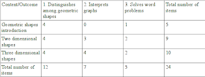
Note that this type of chart (Table of specifications) can be a useful resource for construct a test by random questions. So, questions are selected randomly by a dual factor: outcome or outcome category and curriculum topic. Teacher may also choose percentage of questions for this dual factor.
Some ideas explained in various personas and scenarios to implement in Quiz UI that i like:
-
feedback to students after quiz
-
integrate resources in quiz questions, like articles from newspapers, textbooks, Word documents, pdf's, swf's, etc. students can use this material before or in the exam.
-
import questions created by students for teacher question bank
-
questions bank shared with other teachers. each question have relevant information: feedback about issues from students, issues discovered while reading students' exam answers, statistical data
-
a model/template answer. well, maybe versions look like more appropriate...i explain later.
-
feedback templates
-
information about the questions (metadata) would need to be stored with the questions
-
"Harvey" preparing questions has a interesting feature: questions in different languages and students chose language in the exam. This remind me the CCNA Cisco academy course...we can chose questions language.
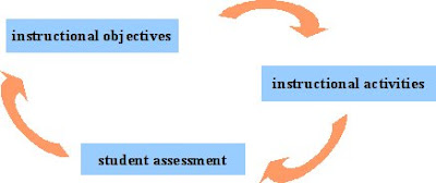
I would like to explain that my main ideas about instructional objectives and student assessment are based in Norman Gronlund investigations. He thinks that the three components: instructional objectives, instructional activities and student assessment are part of a process, the instructional process.
Some ideas that can be improved:
-
relevant information that each question store: course, unit, outcome category, outcome, questions characteristics, statistical information
-
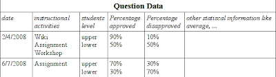
since we have two components behind student assessment (instructional objectives and instructional activities), i think relevant statistical information for each question are: question assessment date, instructional activities associated with the outcome or outcome category in the question and a link to activities grades, for students that pass exam (upper level) percentage of students that pass the question (approved) and that fail the question (disapproved), other statistical information...
In multiple-choice questions, Gronlund suggest a very interesting item analysis including “item difficulty” and “discriminating power”. In a question like:
H L 1. As assessment instrument is properly classified as objective when:
1 3 A. the instrument uses objective-type questions.
1 2 B. the responses called forth by the instrument are free of options.
0 1 C. those preparing the instrument used standard procedures of construction.
8 4 D. there is agreement among scores concerning the correctness of the answers.
he record the results of the 10 highest scoring students (H) and 10 lower scoring students (L). In this question, answer is in bold. Then he aggregates question data like:
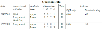
To determine the percentage of high scorers and low scorers passing the item by adding by zero:
H=8 out of 10 = 80
L=4 out of 10 = 40
Obtain item difficulty by adding the percentage correct in the high and low groups and dividing by 2. Add a percent sign to the answer:
(80+40)/2=60%
Obtain discriminating power by subtracting the percentage correct in the low group from the percentage correct in the high group. Add a decimal:
80 – 40 = .40
This item analysis provide all the information we need to estimate the following types of information:
-
the difficulty of the item (percentage of students answering the item correctly);
-
the discriminating power of the item (how well the item discriminates between high and low scorers);
-
the effectiveness of each alternative (all should be chosen and each one more frequently by the low scoring group).
I know teachers that analyze this type of data for future decisions about objectives, activities or achievement tests, and even decisions about complement activities for students that didn't pass the exam. I know other teachers that discus this data with students analyzing test items by percentage of high and low scores, item difficulty and discriminating power.
In "Ida" preparing question you say “Teachers could have an option to have a “give feedback about this question” button in the exam”. I don't do this with my students. I think it's more valuable discuss with them after the exam.
-
import/export facilities with all meta-data generated. Careful with some links inside question to other items like activities and versions...Links to activities are irrelevant to other course that don't have permissions to consult activities in the original course. Links to other versions of question only make sense if admin/teacher imported/exported all versions of a question.
-
about organizing questions: like I said in point 1. each question has some information. So, question can be organized and searched by these information: course, unit, outcome category, outcome, questions characteristics, statistical information.
New ideas:
-
for sites or course questions, i think question versions are useful. each version store owner teacher name, date of creation and link to other question versions.
-
preparing the achievement test isn't only about constructing relevant test items. When I prepare an achievement test I would like to know: 1) what instructional objectives I want to evaluate; 2) what curriculum topics I have to include; 3) what achievement domain I want to be measured and provide guidelines for obtaining a representative sample of test tasks. For this propose, Gronlung construct a two-way chart called Table of Specifications like this:
Note that this type of chart (Table of specifications) can be a useful resource for construct a test by random questions. So, questions are selected randomly by a dual factor: outcome or outcome category and curriculum topic. Teacher may also choose percentage of questions for this dual factor.
Final thoughts:
I read your “Quiz UI redesign prototype presumptions” wiki page and I assume there are moodle users that simple want to make a one-time quiz, don't bother with categories, a structure, etc. But my vision about moodle and other technologies in education is: they only deserve my time if they are better than paper-based resources. “Better” implies: better pedagogical foundations, real integration with other resources, not time consuming material hard to students learn and use. When I think about a technology to use with my students I don't think about paper substitution and quick access to data. This data had to be meaningful data!! A beginner Quiz UI and a advanced Quiz UI seems to be a good solution.
First, I must point out that I deserve no credit for this. Olli has been working almost completely independently, so credit where it is due.
You suggest a lot of good ideas about increasing the sophistication of the Moodle quiz as a pedagogic tool, but I think that they go beyond the scope of Olli's current work. What Olli is doing is simplifying and streamlining the interface for the basic task of creating questions and assembling the quiz. I think it would be easier to implement some of your ideas for providing advanced functionality after the interface has been simplified by Olli's project.
Also, some of the ideas you talk about are already, at least partly, present in Moodle. For example, Item Analysis is already present as a quiz report, and is being substantially improved for Moodle 2.0, see http://docs.moodle.org/en/Development:Quiz_report_enhancements. However, at the moment, this information is only available about a particular quiz after the quiz has been finished. It would be nice to close the loop and make that information available in the question bank for teachers constructing new quizzes (subject to permissions settings). However, that is a relatively small enhancement that could be built on top of the existing functionality, once it is finished, and it is separate from improving the existing functionality.
Also, the particular item analysis calculation you describe is not the best. It is a simplified procedure, designed so that a teacher can do it with just with pencil and paper by hand. Once you have a computer available, more sophisticated statistical calculations are possible, that generate more significant numbers, and that is what the Moodle quiz reports do.
Moodle 1.9 introduced a generalised tagging system (generalising the tagging that was possible before only in blog posts), and also the idea of (learning) outcomes that could be associated with various activities and reported through the gradebook. One of my tasks for Moodle 2.0 is to work out how best to integrate these mechanisms into the quiz and question bank. Tagging questions certainly makes sense. And maybe associating questions with outcomes. However, the difficult part there is working out how to incorporate these options into the user interface.
Just to let you know, we are now contemplating the question of whether this new interface should be included in Moodle 2.0. However, I will start a new thread about that, to make sure that people notice it, and because I hope lots of discussion will take place.